How to Design an E-commerce Website That Converts
An e-commerce website isn’t just a digital storefront—it’s your most powerful sales tool. But having a website alone is not enough. To succeed, you need a design that encourages visitors to stay, browse, and buy. In other words, your website must be built to convert traffic into sales.
Good design balances aesthetics, usability, and trust-building elements. In this article, we’ll break down how to design an e-commerce website that converts, covering everything from layout and navigation to product pages and checkout optimization.
1. Understand Your Customers First
Before diving into design, you need to know who you’re designing for. A store that sells luxury jewelry will look and function very differently from one that sells budget fitness equipment.
-
Research your audience: What do they value most—price, speed, or quality?
-
Map their journey: Understand how they find you, what information they need, and what convinces them to buy.
-
Identify pain points: Do they hesitate at shipping costs? Do they need extra product details?
When your website reflects your customers’ needs and behavior, it’s far more likely to convert.
2. Keep the Design Clean and Simple
Clutter is the enemy of conversion. A clean, minimalist design keeps the focus on your products and avoids overwhelming customers.
-
Whitespace matters: Give breathing room between images, text, and buttons.
-
Consistent branding: Use a clear color palette, fonts, and logo placement.
-
Avoid distractions: Pop-ups, flashing banners, and too many calls to action can scare away buyers.
Think of your design as a guide that smoothly directs visitors toward making a purchase.
3. Prioritize Mobile-First Design
More than half of online shopping happens on mobile devices. If your site isn’t optimized for small screens, you’ll lose sales.
-
Responsive design: Ensure layouts adapt automatically to any device.
-
Large, tappable buttons: Small links are frustrating on phones.
-
Fast mobile speed: Compress images and use caching to avoid delays.
-
Mobile-friendly checkout: Simplify forms and enable digital wallet payments like Apple Pay or Google Pay.
Mobile-first design is no longer optional—it’s essential for conversions.
4. Optimize Website Speed
A slow website kills conversions. Research shows that every second of delay can reduce conversions by up to 7%.
-
Use lightweight themes: Avoid heavy plugins and scripts.
-
Optimize images: Compress without losing quality.
-
Enable caching and CDNs: Deliver faster load times globally.
-
Monitor regularly: Use tools like Google PageSpeed Insights or GTmetrix.
When your site loads fast, customers are less likely to abandon their carts.
5. Create Clear Navigation
If customers can’t find what they’re looking for, they won’t buy. Good navigation reduces friction and encourages exploration.
-
Simple menu structure: Use clear categories (e.g., Men → Shoes → Sneakers).
-
Search functionality: Add filters, autocomplete, and typo tolerance.
-
Breadcrumbs: Help users track their journey and go back easily.
-
Highlight bestsellers or new arrivals: Make them easy to find.
A clear, intuitive path increases the chances that visitors will reach your checkout page.
6. Craft High-Converting Product Pages
Product pages are where buying decisions happen. Every detail should reduce hesitation and push customers toward “Add to Cart.”
-
High-quality images: Use multiple angles, zoom options, and lifestyle photos.
-
Videos or 360° views: Show products in action.
-
Detailed descriptions: Highlight features and benefits, not just specs.
-
Customer reviews: Display authentic feedback to build trust.
-
Scarcity and urgency cues: Phrases like “Only 3 left” or “Sale ends soon” can drive quick action.
The more confident customers feel about the product, the more likely they’ll buy.
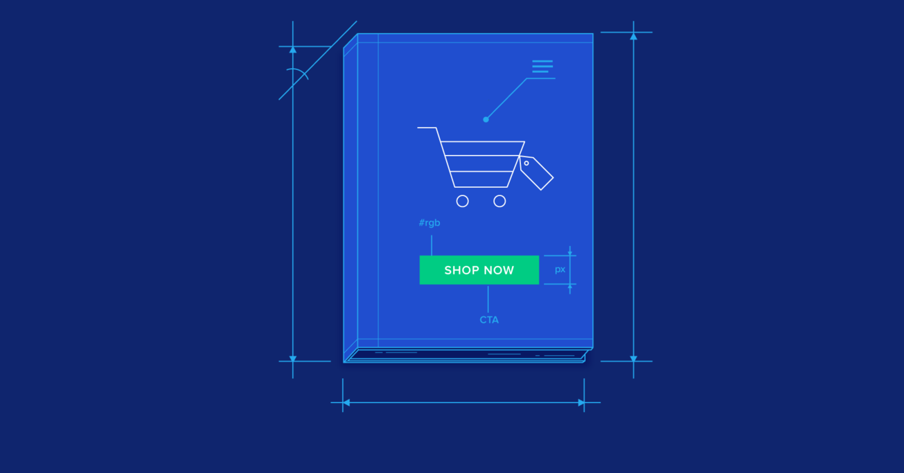
7. Use Strong Calls to Action (CTAs)
Your calls to action should stand out and clearly tell visitors what to do next.
-
Action-oriented text: Instead of “Submit,” use “Buy Now,” “Add to Cart,” or “Get Yours Today.”
-
Contrasting colors: Make buttons pop against your background.
-
Strategic placement: Position CTAs above the fold and repeat them on longer pages.
Strong CTAs guide shoppers down the conversion funnel with minimal friction.
8. Simplify the Checkout Process
Cart abandonment is a huge problem in e-commerce—often caused by complicated checkout flows. Simplifying this stage can dramatically increase conversions.
-
Guest checkout: Don’t force account creation.
-
Minimal form fields: Only ask for essential information.
-
Multiple payment options: Credit cards, PayPal, and local payment methods.
-
Progress indicators: Show customers how many steps are left.
-
Transparent costs: Reveal shipping and taxes early, not at the last step.
A seamless checkout experience keeps buyers from dropping off.
9. Display Trust Signals
Shoppers need reassurance that their purchase is safe and worthwhile.
-
Security badges: SSL certificates, payment provider logos.
-
Money-back guarantees: Reduce the risk of trying your product.
-
Visible customer support: Display contact info and support availability.
-
Social proof: Show reviews, testimonials, and user-generated photos.
Trust signals remove doubt, making customers feel secure enough to buy.
10. Use Personalization and Recommendations
Personalized experiences make customers feel valued and encourage bigger purchases.
-
Product recommendations: “Customers also bought” or “You may like.”
-
Recently viewed items: Remind users of products they liked.
-
Dynamic homepage content: Tailor banners or offers based on browsing history.
Amazon is a master of this strategy, and even small stores can apply it with the right tools.
11. Leverage Analytics and A/B Testing
No website design is perfect from the start. Continuous testing helps optimize for higher conversions.
-
Use heatmaps: Tools like Hotjar show where users click and scroll.
-
Track funnels: Google Analytics can reveal where customers drop off.
-
A/B test design elements: Test CTAs, layouts, colors, and product page structures.
Data-driven improvements ensure your site evolves with customer behavior.
12. Integrate Social Media and Content
Your website doesn’t exist in isolation—linking it with social media and content builds credibility and drives traffic.
-
Social media integration: Add share buttons, shoppable Instagram feeds, or TikTok videos.
-
Content marketing: Publish blogs, guides, or how-to videos.
-
Email capture forms: Grow your list for long-term relationships.
When customers see consistent engagement, they feel more confident about buying from you.
13. Focus on Branding and Storytelling
Design isn’t just visuals—it’s how you make customers feel. Strong branding helps your store stand out.
-
Unique brand identity: Colors, fonts, and tone that reflect your niche.
-
Engaging About Us page: Share your mission and values.
-
Consistent tone of voice: Keep messaging uniform across all pages.
When customers connect emotionally with your brand, they’re more likely to buy and stay loyal.
Final Thoughts
Designing an e-commerce website that converts requires more than good looks. It’s about understanding customer needs, removing friction, and guiding shoppers smoothly from arrival to checkout.
From clean layouts and mobile-first design to optimized product pages and trust-building signals, every element of your website plays a role in boosting conversions. And remember, optimization is ongoing—use analytics, testing, and customer feedback to keep improving.
Your website is your most powerful salesperson. Design it thoughtfully, and it will not just attract visitors but also turn them into loyal customers.